Smartphones
Smartphone Web browser customization
Some extra information can be added to your website to allow display customization of some web browser elements when visiting your site. These options can be added to your site from the following screen : "Options > Smartphone" in TOWeb V7-V14 (and "File > Your website" in TOWeb V6).
Web browser status bar color on smartphones
Some browsers may recognize and use a custom color defined for the display of their elements if the version of the mobile platform supports it too. This is the case with the Google Chrome browser and web browsers offered by default in Android devices but also with Windows Phone devices. By using and adding this option to your site, you allow Internet users to view your site better suited to your theme, as shown in the example below with a screenshot before and after using a custom color.
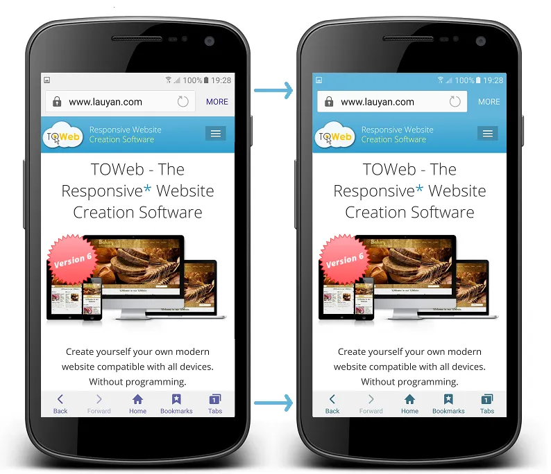
The above screenshots were made by a Samsung Galaxy S6 and its default web browser. The way custom color is used (or not) to color certain elements depends on web browsers, their versions and the version of the platform supporting (or not) such option.
If you want to reuse a color already present in the theme of your site, you need to proceed as follows: from step "Theme" click on the original element and then on its color button. Once the "Colors" window is opened you can select and make a copy of its "color code" to the clipboard and then reuse this code with a paste. Finally, if you do not want to use any of custom color simply leave (or reselect) the "Auto" color.
On the iOS platform with the Safari browser there are 3 possible display choices : the normal default display of a web page in Safari, the display with a status bar using a black background and the status bar display using transparency. For these 2 last option to work, it is necessary to have saved your site URL not among the favorites of your iPhone / iPad but as an icon on your home screen by using the "Share" (  ) "Add to Home screen" ( ) and then open your site directly from this icon (given that the icon to be used will be your favicon or the iOS icon defined for your site).
Parallax effects
The parallax effects are not always supported or even incompatible with some smartphones and tablets (mainly older models), therefore TOWeb allows you to disable them on these touch devices for all pages of your site.
Full screen height
The full height option often forces you to only put very few information on the screen so that everything can also be seen on low-resolution devices such as smartphones. If you notice that in some low resolution screens all the content is not visible when using the full height option then you will have to disable it on smartphones by adjusting the minimum size below which this effect will be applied (default is 480px).
Force the navigation of your site in landscape mode
Some elements of your pages may need to have a minimum screen width to be presented in the most pleasant and/or readable way possible (like for instance some data tables or reduced size images that are too small to see the details you want to show). If this is the case for some pages of your site, then it may be desirable to activate the display of an animation indicating your visitors to switch their smartphone landscape mode (ie horizontally) when it uses it in portrait mode (ie. vertically).
Paragraph animations
Depending on the performance of some smartphones, the paragraph animations can cause significant slowdowns in the display and/or a less pleasant navigation for these users. Therefore, it is recommended to disable all paragraph animations throughout your site.
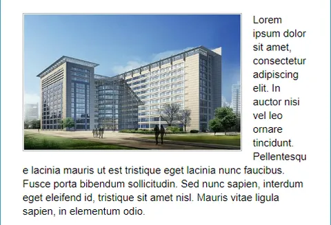
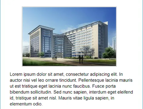
Floating text around images (or any other objects)
Texts wrapped around objects (such as images for instance) are generally not easy to read on small devices as they often have only one or two words per line. To avoid this situation and make your text easy to read for all smartphone users, it is recommended to deactivate the floating object effects of your site from the TOWeb "Options > Smartphones" step.
Note: the use of this option requires a version 8.10 or greater of TOWeb.
If the images (or any other floating objects) on your site have a width near 300px, you should consider setting the maximum width option to 520px (or any higher value). If on the other hand your images or integrated objects have a width between 400px or 500px then you may rather consider to set a the smartphone maximal width to 800px or higher. If necessary, use the smartphone and tablet test buttons located at the top right corner of the TOWeb window to see the result in different screen modes and/or perform an external preview (using the F12 key) in order to test by resizing the window of your browser and make the right adjustment of the value according to content of all your pages.
Phone numbers and Links
On your site you can add SMS links and links to make phone calls so that visitors of your site can directly reach you with a simple click from their smartphone during their visit. The visibility option "mobile only" or "always visible" can then be applied to your links according to your needs.
If you choose to display links or phone buttons also for devices that can not make calls (such as a computer) then these links will be inactive but their content will be displayed. In such a case, it may be desirable to also correctly label your phone number in the text of your link / button rather than just a "Contact me" message to make your number visible to all.
Finally you have the possibility to deactivate at any time all the phone links of your site from the only option "Disable automatic phone number linking" located in the screen "Options > Smartphone" of TOWeb (from version 7 and above).